Some forms are born by chance, others by vision.
What has become Astec’s visual identity, our logo, traces its roots precisely where one of our most ambitious challenges began: Astec’s expansion into the United States in 1996.
This is the story of how an architectural project evolved into a brand mark, becoming the symbol of an entire way of doing business.
It was our first major overseas project, a commission that took us to the heart of North Carolina for the opening of Natuzzi’s first American showroom.
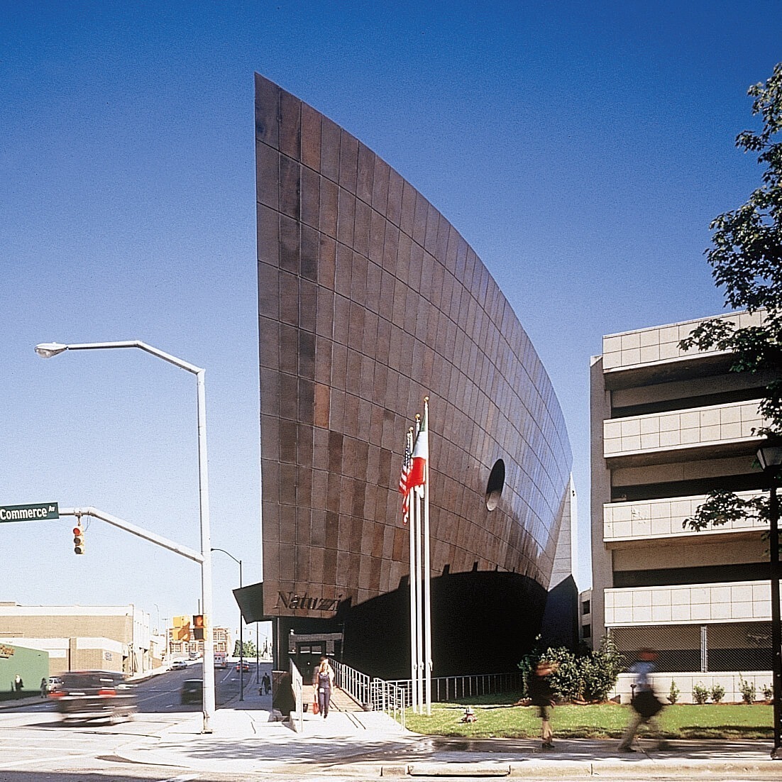
An imposing building, four stories high, designed with a powerful architectural feature: a 1,200-square-meter wall inspired by the bow of a ship, entirely clad in brushed copper alloy.
From this façade emerged a symbol: the ship’s prow sculpted into the metal, with its sharp, dynamic curve, representing a new image, an arrival point, the beginning of an international journey for our work. It also became a new way of telling our story.
How the Logo Came to Be
It was precisely from this geometry, from the copper bow of that “ship,” that our logo was inspired.
A simple yet recognizable shape, evoking dynamism, courage and precision—the qualities that guided us through that project. The façade was composed of 900 panels, each unique, meticulously crafted with millimeter tolerances, installed in just 196 days.
But there’s more: the choice of the brushed copper alloy was not accidental. The client, a company that has long worked with materials like leather, was looking for a cladding material with a similar language: a lively, textured surface capable of aging over time. Bronze, which darkens and transforms as leather does, was the ideal choice.
The façade’s geometry was also highly complex: an irregular, curved profile that posed technical and cultural challenges in an international context, particularly with an American contractor. This demanded our full design capabilities.
It was precisely through this artisanal process that, almost by chance, a lighter panel emerged—a natural variation in the manual aging process that resulted in a distinctive mark, unplanned and spontaneous.
This detail, born from human touch, became the symbol of the entire project.
A Symbol That Represents Us
For Natuzzi, this was more than just an engineering and organizational achievement; it served as a bridge between Italy and America, craftsmanship and industry, ancient materials like bronze and contemporary architectural solutions.
Today, that symbol lives within our brand, reflecting our identity: solid, essential and constantly in motion.
Technical Curiosity: For the façade, 115,000 kg of copper alloy lamination were used. Each panel, unique in shape and size, was crafted with extreme care, maintaining joint gaps of just 30 mm with absolute precision. The lightest panel is the result of a natural variation in the manual burnishing process, making each piece unrepeatable and authentically artisanal.